Building WeeklyMeals from zero to live product
A full operational dashboard for a fresh lunch subscription service in West Palm Beach — designed, defined, and shipped in 2 months as founding designer.
2 Months
Founding Designer
A chef with a business. No system to run it.
Chef Alejandro Ayala had a clear vision: deliver chef-made lunches to busy professionals in West Palm Beach on a weekly subscription model. The food was great. The operation was not — managed entirely through Google Forms, WhatsApp messages, and manual notes.
I came in as the founding designer with a mandate to build everything: the product definition, the brand identity, the public onboarding flow, and the internal operations dashboard. There was no brief. There was no existing system. There was only the business logic in Alejandro’s head and a list of growing needs as the first clients signed up.
«The problem wasn’t that we lacked tools. It was that we didn’t even know yet what the right tools needed to do.»
— Discovery process, Week 1
- Client signups via Google Forms
- Delivery tracking on WhatsApp
- No payment state visibility
- No subscription lifecycle management
- Plan progress calculated manually
- No way to contact clients quickly
- Zero data about the week ahead
- Public multi-step onboarding form
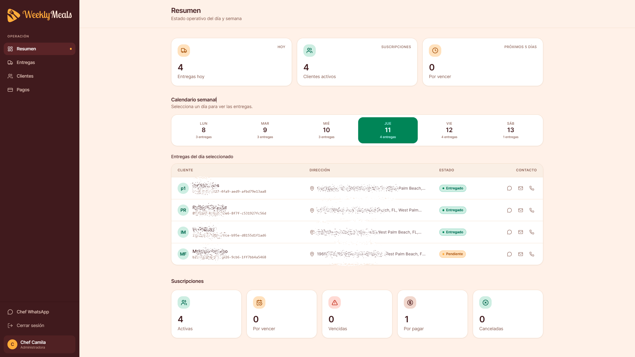
- Delivery dashboard with weekly calendar
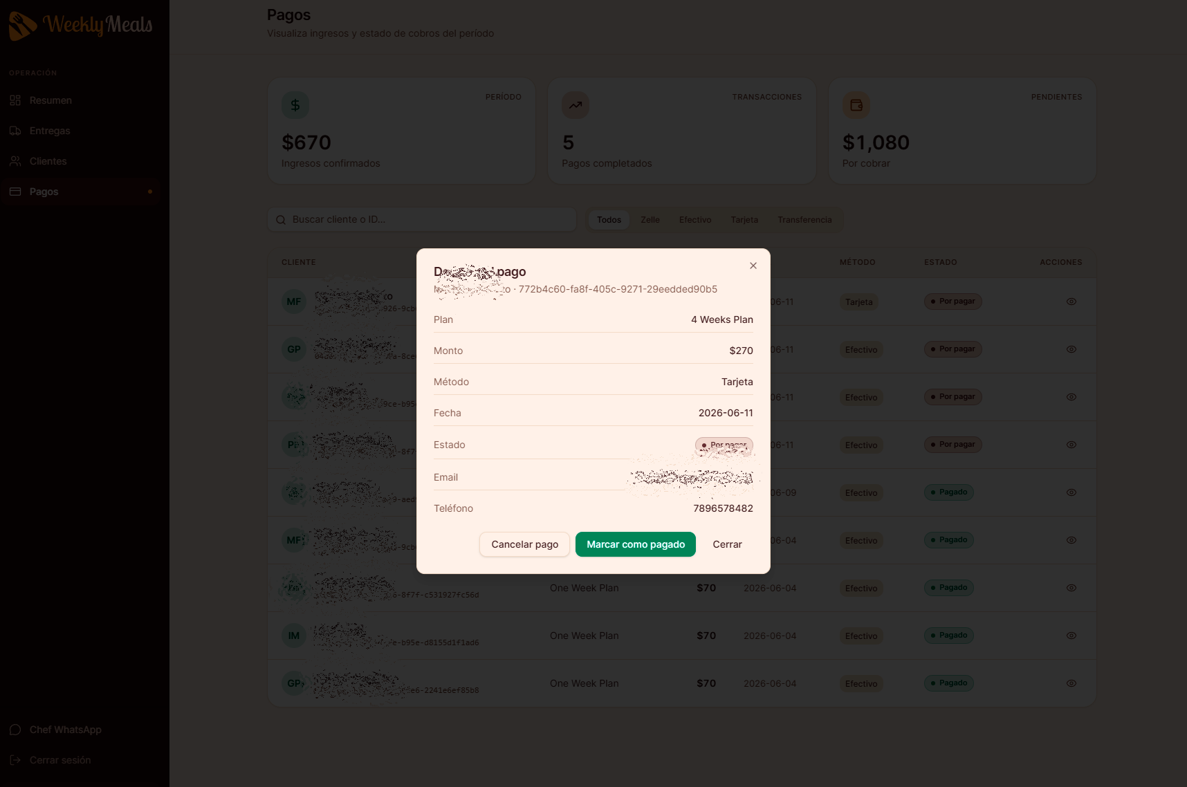
- Payment status with one-click confirmation
- Full subscription lifecycle with auto-renewal
- Progress based on meals delivered, not days
- One-tap WhatsApp / call / email per client
- Operational summary available every morning
The real problem wasn't missing features. It was missing clarity.
Before designing a single screen, I had to define how WeeklyMeals actually works — not as a tech product, but as an operational business. This meant translating Alejandro’s mental model into a system with clear states, rules, and flows.
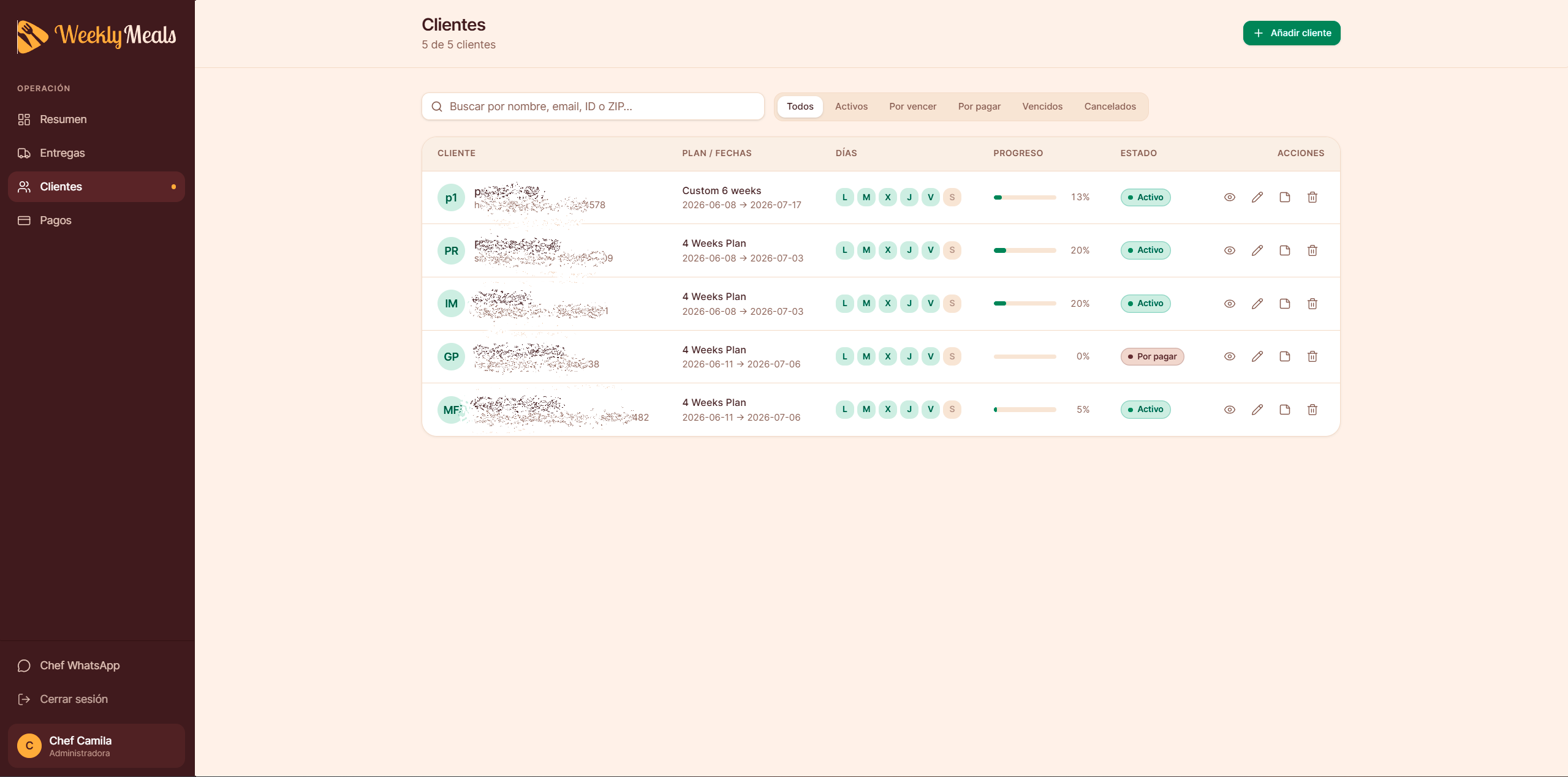
The critical insight that shaped everything: WeeklyMeals doesn’t operate by calendar days. It operates by meals. One week = 5 lunches, Monday to Friday. Two weeks = 10 lunches. Any progress metric, subscription end date, or plan duration had to be calculated from delivered meals — not time elapsed.
Design principle established early: Every state in the system must have a clear trigger, a clear visual indicator, and a clear action the admin can take. No ambiguous states. No dead ends.
The five states that govern everything
One of the first deliverables wasn’t a wireframe. It was a state map for client subscriptions:
01
Pending Payment
Client registered, awaiting confirmation
02
Active
Paid, deliveries being generated
03
Expiring Soon
Final meals approaching
04
Expired
05
Cancelled
Subscription ended by either party
Each state maps to a specific view in the dashboard, a specific badge color, and a specific action available to the admin. This consistency reduced cognitive load and eliminated ambiguity for a non-technical user managing 7–20 clients daily.
Two months of iteration, not two months of planning.
This project moved fast because the business was already operating. Real clients, real deliveries, real problems — every design decision was tested against live operational reality, not hypothetical users.
🗺️ Week 1–2: Mapping the operation
No wireframes yet. Focused entirely on understanding the business logic: subscription plans, delivery cadence, payment methods, client lifecycle. Translated the chef’s mental model into documented rules.
🏗️ Week 3–4: Architecture & first build
Defined the four core modules (Dashboard, Deliveries, Clients, Payments), their data relationships, and the visual system. Built the first working version with Lovable using a highly structured prompt system.
🔁 Week 5–7: Operational testing
The chef used the app during live operations. Each session revealed edge cases: dates calculated on calendar days instead of meals, WhatsApp links using the wrong URL format, payment states that didn’t propagate correctly.
🚀 Week 8: Production launch
Stripe integration for card payments, public onboarding form synced to the admin dashboard, protected login, and full Supabase persistence. WeeklyMeals went live with 7 paying clients.
On using Lovable: The tool generated the code. The product thinking — what to build, why, how it should behave, what edge cases matter — that came entirely from the design process. Any developer can prompt a tool. Knowing which system states to define before writing the first prompt is a different skill entirely.
The choices that made it work.
Each of these decisions was made in response to a real problem observed during operation — not a best-practice checklist.
1. Meals as the unit of truth, not days
The initial build calculated subscription progress using calendar days. This broke immediately: a one-week plan showed «8 days» because it counted the weekend. It also showed false progress for clients who hadn’t received a single meal yet.
The fix was architectural, not visual: redefine the core data model so that every metric — progress bar, end date, renewal trigger — derives exclusively from the count of delivered meals vs. total meals in the plan. 1 week = 5 meals. 4 weeks = 20 meals. Saturdays and Sundays are irrelevant to the system.
Result: Progress bars became accurate. End dates became predictable. Renewal triggers fired at the right time. One data model decision fixed three visual problems simultaneously.
2. Payment confirmation as the gate to operations
Early versions showed new clients in the delivery schedule immediately after registration, regardless of payment status. This meant the chef was preparing meals for clients who hadn’t paid yet.
The solution was to enforce a strict state machine: client creation → Pending Payment → payment confirmed → Active → deliveries generated. Only active clients generate delivery entries. Only active clients appear in the daily schedule. The payment step is the gate.
Result: Zero accidental deliveries to unpaid clients. The dashboard’s «Today» KPI became reliable — every client listed had a confirmed, paid subscription.
3. WhatsApp as the primary communication channel
The admin’s real communication with clients happened entirely on WhatsApp. The initial design included email, phone, and WhatsApp buttons in every client row — but the WhatsApp integration kept breaking because it was using the api.whatsapp.com URL format, which is blocked by most browsers.
Beyond fixing the URL to wa.me/[number], I designed a delivery confirmation modal that pre-fills a branded message when a meal is marked delivered — giving the admin a one-tap workflow that also serves as a quality touchpoint with the client.
Result: The notification system became a retention mechanism. Every delivered meal ends with a warm branded message, reinforcing the premium positioning of the service with zero additional effort from the chef.
4. Public onboarding designed for trust, not conversion
The public subscription form is the first thing a potential client sees. The initial version felt like an internal admin form — dense, utilitarian, no personality. For a premium food service targeting busy professionals, first impressions matter.
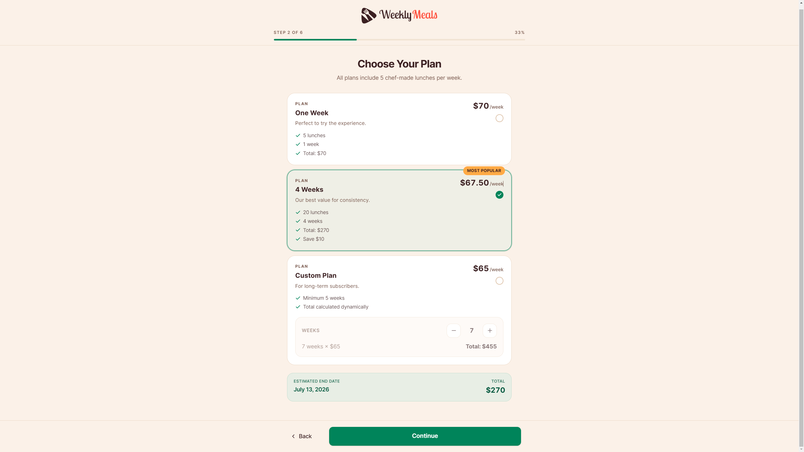
The redesign introduced a 6-step progress flow with clear section naming, visual plan cards showing weekly cost (not just total), a mandatory dietary disclaimer with a high-visibility acceptance checkbox, and Stripe card payments alongside Zelle, cash, and bank transfer. The form became a brand experience, not just a data collection tool.
Result: The onboarding form now matches the premium positioning of the service and syncs directly to the admin dashboard in real time — a client who completes the form appears instantly in the backend without manual entry.
5. Pricing framed as weekly value, not total cost
The original plan cards showed «$270» for the 4-week plan and «$70» for one week — making the longer plan look more expensive at a glance, which is the opposite of what the business needs to communicate.
Reframing to a weekly cost ($70/week, $67.50/week, $65/week) makes the value proposition immediately legible: longer commitment = better weekly rate. The total is still visible as secondary information, but the primary anchor is the per-week price that maps to how clients think about their food budget.
Result: The pricing hierarchy now communicates value instead of total cost. The 4-week plan, which is most profitable for the business, became the obvious «best value» choice — not the intimidating one.
Four modules. One coherent system.
Each of these decisions was made in response to a real problem observed during operation — not a best-practice checklist.
Dashboard
Daily operational overview with KPI cards (deliveries today, active subscriptions, expiring soon), a weekly calendar selector, a per-day delivery table with quick-contact actions, and clickable subscription status cards that open filtered modals.
Deliveries
Weekly delivery management with check-off workflow, delivery notes per client, status badges (Pending / Delivered / Delayed), and the WhatsApp confirmation modal that fires on each marked delivery.
Clients
Payments
Payment history with period KPIs, method filters (Zelle, Cash, Card, Bank Transfer), one-click confirmation and cancellation, and Stripe integration for card payments that auto-activate the subscription on success.
Public Forms
6-step subscription onboarding with delivery day selection, plan choice, subscriber info, address, dietary conditions, and payment. Syncs to Supabase in real time. Accessible without login. Connects directly to the admin dashboard.
Live. Real clients. Real deliveries.
WeeklyMeals launched after two months of design and build. These are real numbers from the first two weeks of operation.
01
Paying clients in week one
2 W
Weeks operating without manual tracking
0
Missed deliveries due to system errors
The chef runs the entire operation — client management, delivery tracking, payment confirmation, client communication — from a single dashboard, every morning, in under 10 minutes.
🧠 Product thinking before tooling
Defining business rules, data models, and system states before designing a single screen. The tool (Lovable) came after the architecture was clear.
🔬 Edge case detection
Identifying logic errors that a generative tool would miss: calendar-based progress vs. meal-based progress, incorrect payment state propagation, broken WhatsApp URL format.
⚙️ End-to-end ownership
From business model definition to brand identity to UX flows to production-ready UI. No handoffs. No gaps. One coherent product perspective throughout.
💹 Designed for scale
The architecture (Supabase, Stripe, role-based auth ready) and information architecture anticipate growth to hundreds of clients without requiring a rebuild.